That line of type of time needs more Kroning.
/What my client meant to request is Kerning. Which seems to be of interest to my clients lately. No kidding; in a meeting someone asked, what is that called? “Kerning,” I responded. Thinking only designers obsessed with typography really care. So, what is kerning? In typography, it’s the process of adjusting space between letters to achieve a more visually appealing outcome. Usually designated to individual letter pairs in headlines or large type. Tracking has do with the uniform space over a range of characters.
So, a little history thanks to Wikipedia: In the days when all type was cast metal, a corner was notched to a consistent height on one or both sides of a letter-piece. Such notched pieces were only set against one another, not against unnotched ones, which had straight sides. The corner allowed for a character’s features to reach into the area normally taken up by the next character, for example the top bar of the T, or the right diagonal stroke of the V to hang over the bottom left corner of an A. Having a consistently shaped corner cut out allowed for using fewer pieces of type to make up all possible kerning pairs; for example a T- and V-piece with kerning on the right would match the same A piece with a matching kerning indention on the left.
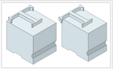

So why bother with this at all? Readability. Beauty. Knowledge. If you view the A and V without kerning you may notice your eye focuses on the space between the letters — slowing down your ability to read and absorb the message. A trained eye appreciates the attention to detail, of uniting those letters so they work together. It’s an understanding of space and the necessity of adjusting that space when letters vary in shape. Following is an example of this in my design for my client, the headline required kerning.

So, go forth and Kern and appreciate the visual beauty of type. Ciao, Lynne